FFHS Zurich
Educating means guiding
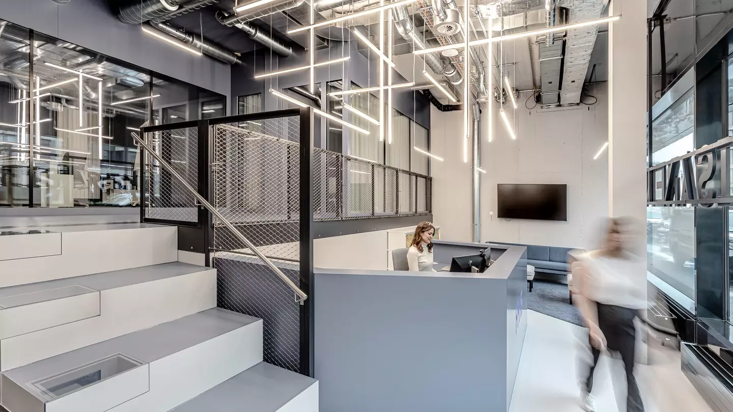
The Swiss Distance University of Applied Sciences (Fernfachhochschule Schweiz – FFHS) is situated in the Gleisarena overlooking the tracks of Zurich’s main train station. In addition to the virtual spaces it provides for tuition, it also needs a physical point of contact for potential students, enrolled students and lecturers that also serves as a back office for student advisory services. In what used to be a retail space of just 116 square metres there is now a multi-purpose reception area whose design was inspired by the university’s motto: Bildung heißt Begleitung, or “educating means guiding”. At the FFHS, knowledge is acquired for the future, so where better to obtain advice and support for career choices than here, in a way that is cooperative, innovative and personal.
We were able to prove with this project that even small areas can become multi-purpose with the right colour and lighting concepts and simultaneously express strong emotionality.
“The FFHS has many different target groups and provides an abundance of opportunities to gain knowledge. It would be easy to feel overwhelmed by all that’s on offer. That’s why the redesigned reception area should above all display clarity.”
Marianna Maslow, Design Lead, Drees & Sommer
Two areas
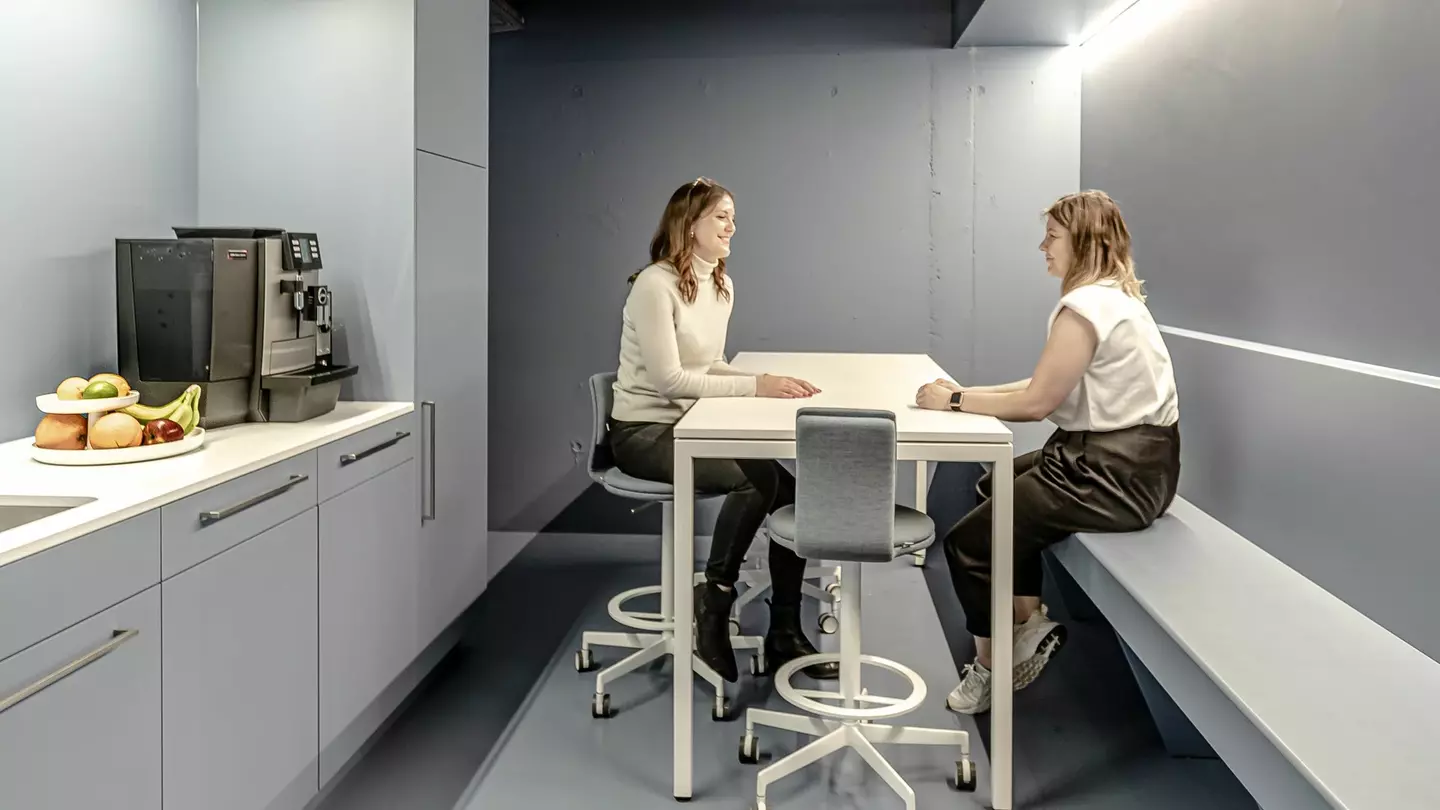
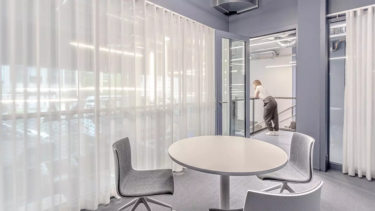
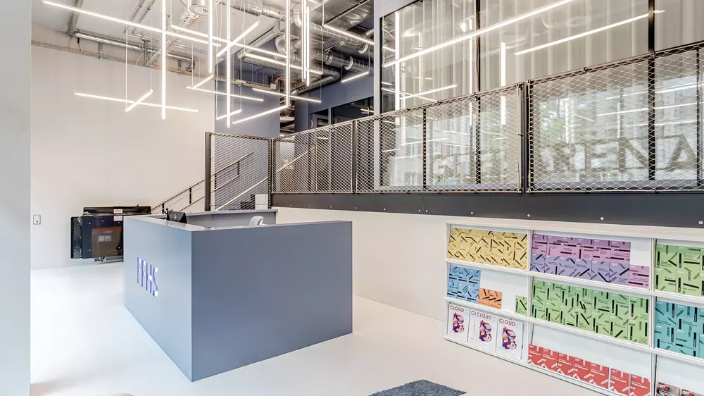
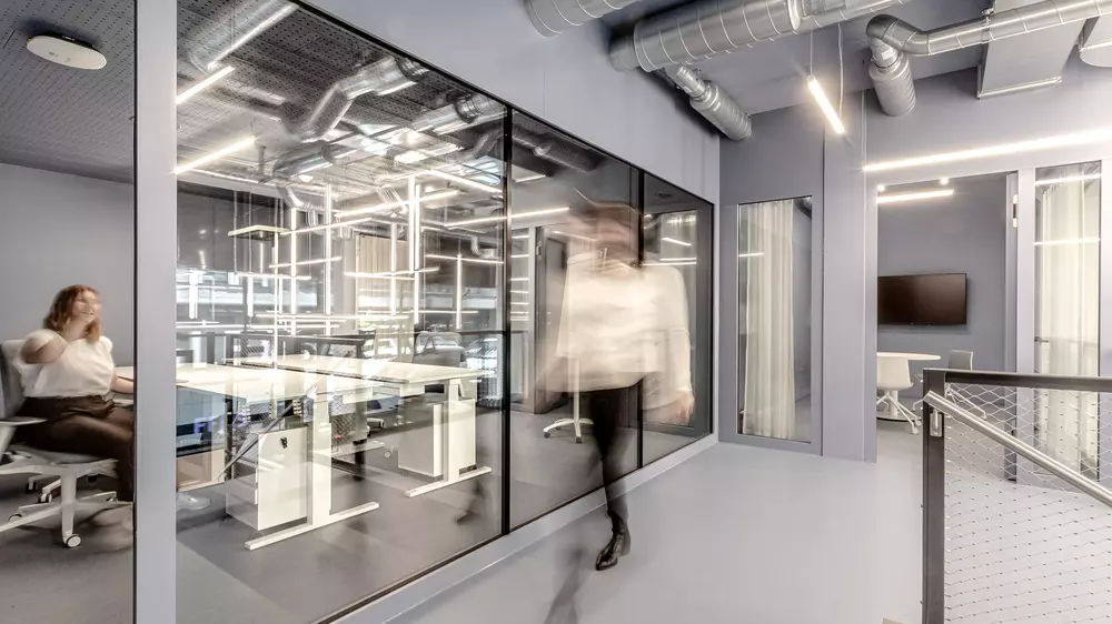
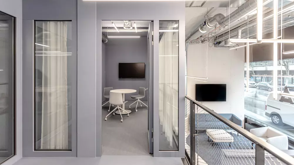
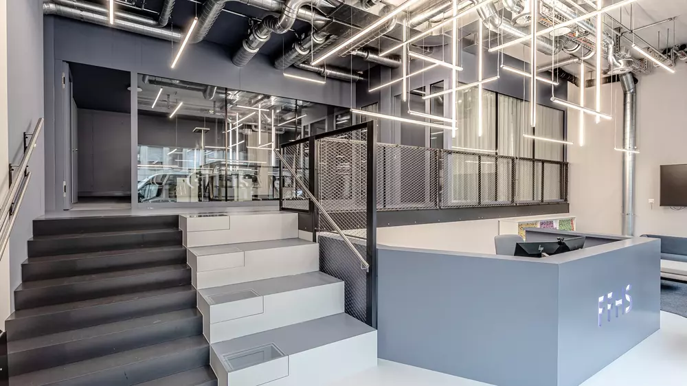
Polarity is the core element of this design: two areas – one of them public, one non-public – with different functions and on two levels. They are separated not only physically but also by colour and light. Coming in from the street you enter the reception area that has a counter as the central point of contact. It can be seen clearly from the outside through the glass façade. Stairs lead to the second level. Up here there is a back office and a staff break room, which form the non-public area but still exhibit transparency and clarity thanks to a glass partition. The meeting room situated on the gallery acts as a semi-public area and joins the two worlds together.
Colour contrasts
We used two colour schemes to create a visual distinction between the upper and lower levels. The shades of light blue, grey and white in the reception area emphasise its function: to advise and inform. It should enable people to approach matters with a clear perspective. The surfaces in the upper area are a darker contrast colour throughout to distinguish them from the public area.
We also included the staircase in our colour concept, using a light shade on the vertical surfaces and a darker shade on the horizontal ones. The steps themselves have a special feature: they have boxes incorporated in them to store information material on the various qualifications.
A core element: light
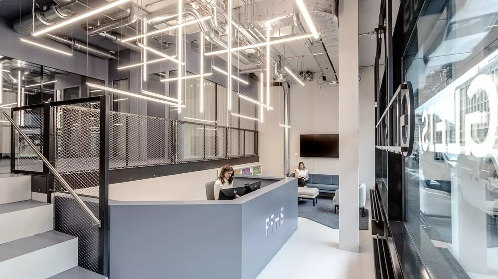
The core element of our lighting concept is the use of a contrast between light and dark to structure the space. The reception area, being the main point of contact, radiates light and openness and extends a welcome to visitors. The light fixtures themselves play an important part in the arrangement, their lines all joining together above the reception counter. Like signposts they guide us through the area and underscore its information function. The second level reflects a darker and calmer style, thereby visibly distancing itself from the open area accessible to the public.
The courage to do something new
Courage is in the credo of the FFHS. The university wants to explore new avenues in teaching, research and services. And this is a good thing, because it has allowed a new place full of contrasts to emerge. A place where, through linearity, reduction and simplicity, we have succeeded in provoking the desired associations: foresight, clarity and informality.
“There are not many clients who are open to the suggestion of painting an entire room in colour. But that’s precisely how to send a strong signal to the world.”
Marianna Maslow, Design Lead, Drees & Sommer
Facts
Fernfachhochschule Schweiz (FFHS)
Interior Design
Workplace Consulting
Project management
Cost management
Construction management
Project duration: October 2020 - April 2021
GFA: 116 m²
Photos: Arnold Weihs
